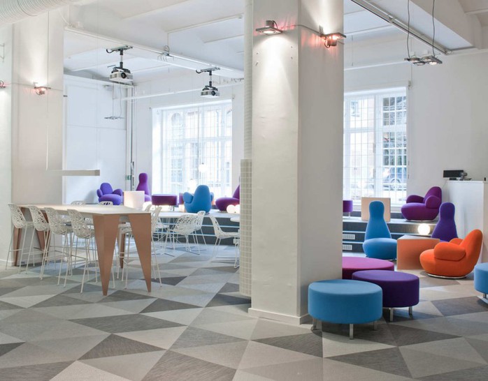
Have you ever seen a beautiful office and gasped, "Wow, I would love to work here"?
For any company, there's more to an office than just walls, cubicles, and an instant coffee machine tucked in the corner. An office is a recruitment tool, idea hub, second home, and hopefully its employees' favourite place to be. In the last decade, corporate offices saw a major shift. They moved from polished, centrally located, impeccable buildings with white and beige walls and no evidence of life into hip areas bursting with culture, colours, and liveliness. Offices became a place where colleagues and friends share their ideas and let them grow bigger.
Which offices are the coolest places to work? Here's a list of the top ten.
MICROSOFT
Location: Vienna
Square feet: 14,764
Designer: INNOCAD architektur
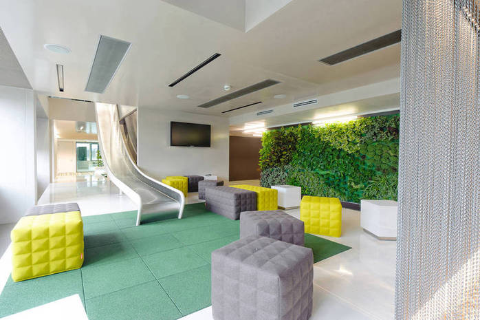
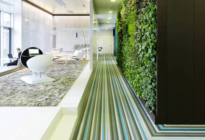
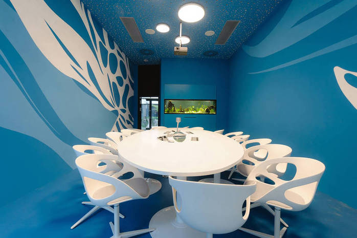
Microsoft’s new office space in Vienna was completed by INNOCAD architektur in 2011 for $3.6 million. To create the ideal constellation of physical, social, and virtual work environments, Microsoft observed and studied their employee structure using five categories, from the resident (fixed workstation, always in the office) to the nomad (hardly ever in the office), and used this information to create a custom-tailored interior program. Every employee can now select her ideal environment, according to her needs and mood.
The design combines colourful, fresh, and eye-catching design elements and themed rooms. Conference rooms, meeting rooms, and reception are all designed to be unique to the tasks at hand for each location. One of the best features of Microsoft's office is a large, two-storey slide that that deposits riders into a bevy of geometric cushions.
Photo: Paul Ott
PARLIAMENT
Location: Portland
Square feet: 4,000
Designer: Chris Erickson
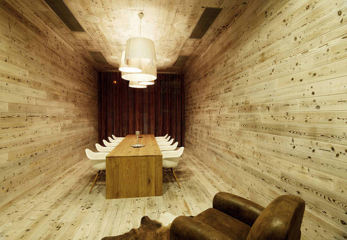
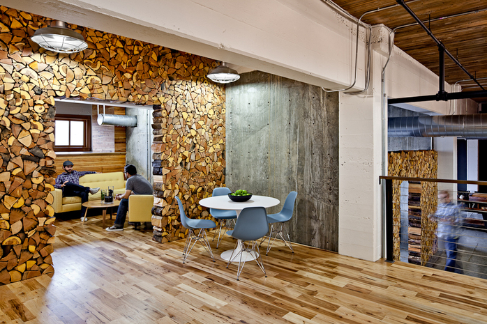
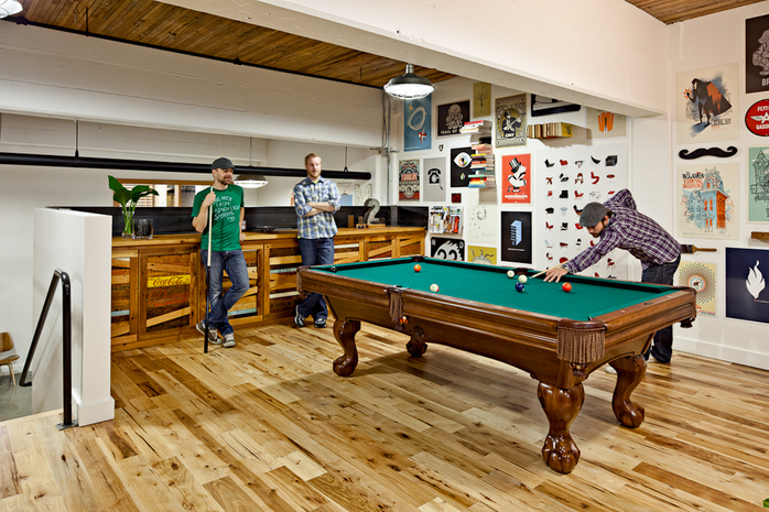
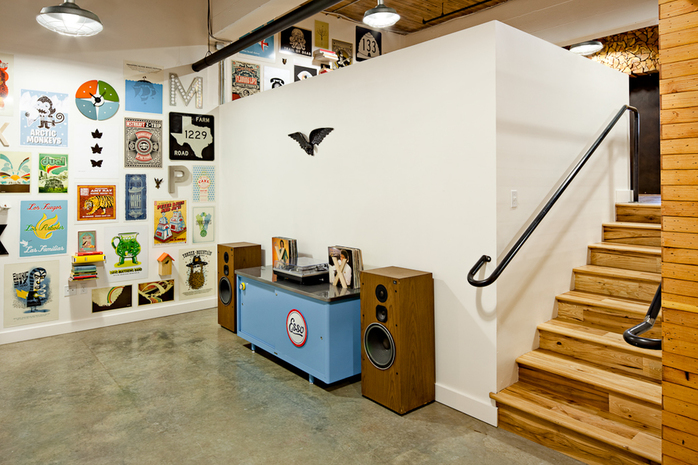
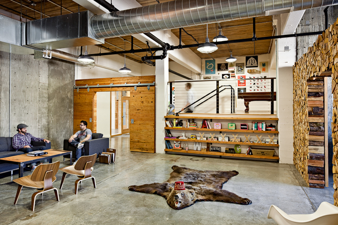
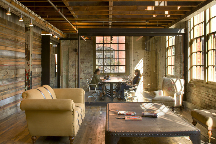
Parliament is a full-service design studio that offers a huge range of services in the fields of print, retail, marketing, and digital design. It bought a raw, factory-style room and put its creativity to work with its team's own hands. Exploring the black colour, concrete, metal, and wood, the Parliament team built one of the most amazing studios around. All the spaces are integrated and explore the simplicity of each element inside the office. The office embraces the rustic charm of a log cabin with, hardwood lining the floors and campfire logs covering the walls. Parliament's office isn't only jam-packed with beautiful things to look at, but it's also full of incredibly talented people.
Photo: Lincoln Barbour
GRUPPO GALLEGOS
Location: Huntington Beach, California
Square feet: 40,000
Designer: Lorcan O'Herlihy
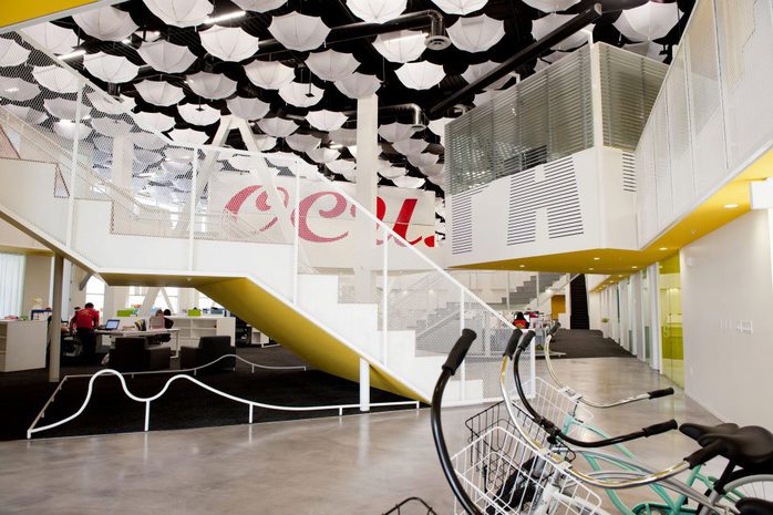
Grupo Gallegos is the award-winning Hispanic advertising agency from California. It's known for its hilarious ad campaigns for the California Milk Processor Board (Got Milk?), Comcast, and Fruit of the Loom. Architect Lorcan O'Herlihy, founder of LOHA Architects and winner of seven AIA/LA design awards and 26 national and international awards, wanted to create a "liveable working space." The Grupo Gallegos work model offers surf breaks by the pier, a fleet of beach cruisers, a full basketball and indoor football court, gym, a batting cage, spinning and yoga classes, and plenty of space to run laps around the office.
Photo: Gruppo Gallegos
QUID
Location: San Francisco
Square feet: 5,200
Designer: Studio O+A
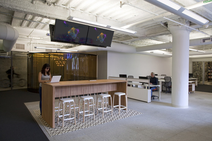
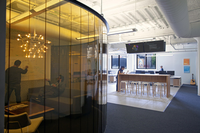
San Francisco is home to many wonderful offices, of which Quid is another example. Quid's office was designed by Studio O+A, a local interior design firm known for designing Facebook, Microsoft, and Yelp's offices, and it's proof that beautiful things don't need to be expensive. Quid's dream office cost just $25,000. To keep the budget low, designers decided to use alternative solutions whenever possible. Rather than build another conference room, which would inevitably make the office feel smaller and the budget tighter, Q+A commissioned a custom metal hoop to hold industrial-grade freezer curtains to form this circular office space. The desks came from a furniture company next door.
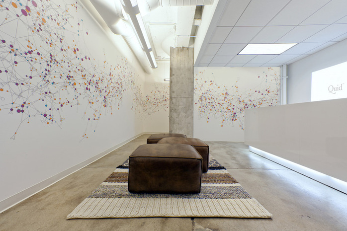
The reception area is one of the most beautiful parts of the office. It's a long, crooked corridor with the actual Quid infographics displaying colourful data points and lines on the wall. Murals help you find your way into the office, similar to how Quid’s software allows users to import, manipulate, and understand complex sets of data. Visitors will undoubtedly have a sense of this parallelism after entering the lobby.
Photo: Jasper Sanidad
Location: London
Square feet: 160,000
Designer: Penson Group
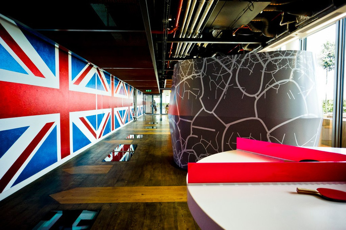
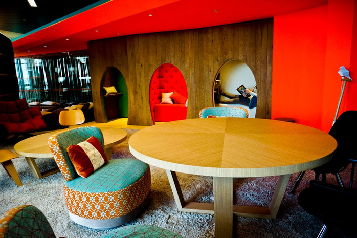
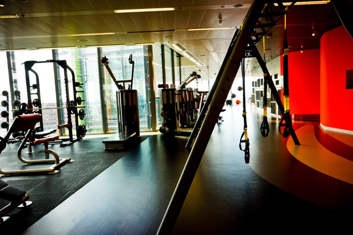
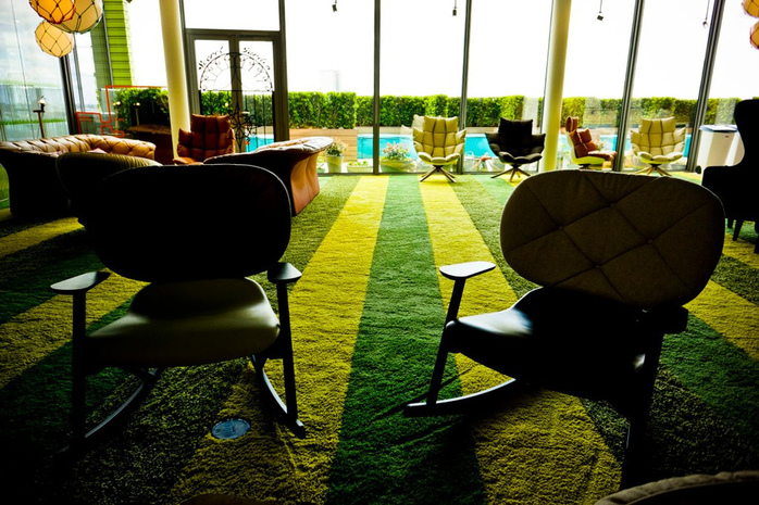
Google has recently moved into its third office building in London, which was designed by Penson Group. The office features Union Jack flags, balcony gardens, and allotments where staff can grow vegetables. The HQ offers everything an employee could dream of. It contains indoor and outdoor workplaces, a gym, a dance studio, a café, and a 200-person event room named the "Town Hall." Communal areas are furnished like old-fashioned living rooms, with rocking chairs, high-back armchairs, and woollen pouffes.
The combination of seriousness and playfulness is behind quirky office room names such as Secret Gardens, Allotments, Google Green, Google Park, and Grannies Flat. Googles’ famed “Red List” focuses on removing toxic ingredients of materials, and their office is definitely an example of this approach. The space is full of reclaimed or recycled material, and the floors are lined with timer boards to make the space smell fresh.
Photo: Martin Varsavsky
QUIRKY
Location: New York City
Square feet: 27,500
Designers: Spector Group & Ben Kaufman
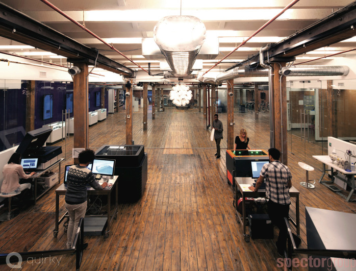
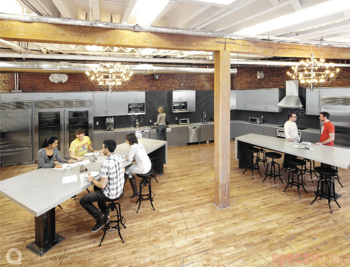
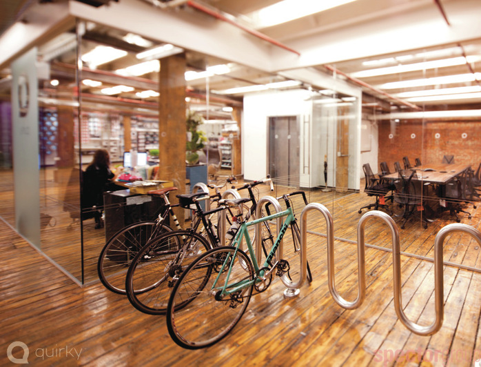
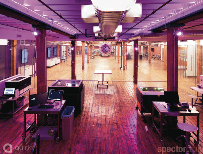
Quirky turns the laziest people into inventors. Quirky users can submit their ideas for as little as $10, and other readers will choose the best idea. Quirky will make the product if your idea is chosen, and it will pay you a lifetime royalty. It recently moved into a new space on the west side of Manhattan. Quirky’s new offices are located on the second floor of an old warehouse. It's the perfect kind of space for the company, with plenty of room for workshops and meeting rooms and all the other tools needed for a collaborative invention hub.
Everything you see in the office is made by employees. People consider a lot of stuff a garbage, but they turned them into pieces worth admiring. Bases for conference room tables are made from reclaimed sinks, bathtubs, shipping pallets, and in one case, a Bronx high school locker with books from the last person who used it, Luella Rivera. The conference room is named for her. Ben Kaufman of Quirky.com says:
The thing is, we have all this incredibly sophisticated craziness in terms of machinery, yet it’s in this gritty and raw setting in an old building from the late 1800s. This is the first building in New York that combined ship, rail and roads. This is an aesthetic that says we’re creative, you can trust us with your idea, and we can get it done.
Photo: Quirky
AIRBNB
Location: San Francisco
Square feet: 37,000
Designer: Garcia-Tamjidi Architecture
While the company is about to move into its new headquarters at 888 Brannan later this year, Airbnb's current office is nothing short of a design wonderland. The 37,000-square-foot space in SoMa "takes many of its design cues from listings on Airbnb." The design of this office was spearheaded by Jenna Cushner, the Head of Ground Control for Airbnb. A unique detail appeared in the office’s design: Airbnb’s meeting rooms are designed to look like rooms from Airbnb’s rental listings. The home feeling is enhanced by the mouthwatering smells of good food that linger in the corridors. The company employs a full-time chef to provide on-site meals for staff.
The company was founded by Nathan Blecharczyk, Brian Chesky, and Joe Gebbia, and it was created to solve the problem of hosting people in San Francisco for a conference when all hotel rooms were sold out. Like many start-ups, the company's first office was an apartment. Airbnb's philosophy is "home away from home," and its office design directly reflects its culture of collaboration, possibility, and excellent craft.
Photo: Chad Riley
Location: San Francisco
Square feet: 215,000
Designers: RMW Architects, Interior Architects & Lundberg Design
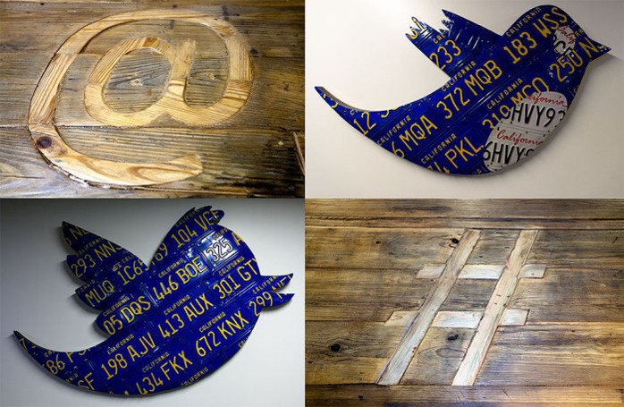
Twitter’s move marked a big change for San Francisco. The area surrounding the newly restored art deco SF Mart building was long due for a revival. Empty storefronts and a somewhat homeless vibe made the area undesirable. However, the City of San Francisco offered Twitter a $22 million tax break to move to this historic Art Deco building in the Mid-Market district, hoping its presence could turn things around.
Twitter is a start-up looking to be a grown-up. Before RMW Architects started designing Twitter’s offices, it sat down with the Twitter team and had a visioning session. Words like "sustainable," "elegant," and "rustic" came out. Many employees had a humble workspace in mind. All in all, Twitter is not Google; Twitter prefers a simple and effortless approach. The biggest advantage of its new office building is a large private rooftop deck and private garden. After all, sitting at the top of the world and overlooking one of the most beautiful cities must be awe-inspiring.
Photo: Troy Holden
URBAN OUTFITTERS
Location: Philadelphia
Square feet: 285,000
Designers: Meyer Scherer & Rockcastle
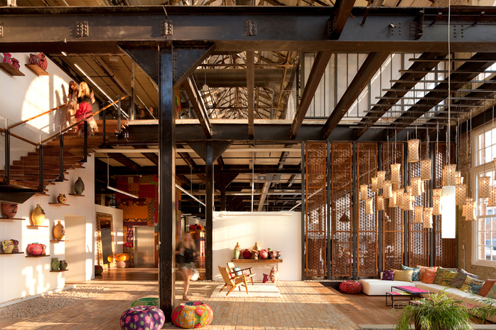
The most amazing thing about Urban Outfitters is its ability to re-use and redesign everything that comes into its hands and turn these materials into unbelievable products. The same applies to its headquarters. This award-winning adaptive reuse project is located on the site of an abandoned Pennsylvania Navy Yard. UO founder Dick Hayne bought four hulking, decommissioned, and dilapidated buildings and invested $100 million into transforming them into a headquarters that would reflect the buildings' industrial roots and corporate philosophy of Urban Outfitters.
Photo: Lara Swimmer
SKYPE
Location: Stockholm, Sweden
Square feet: 18,000
Designer: PS Arkitektur
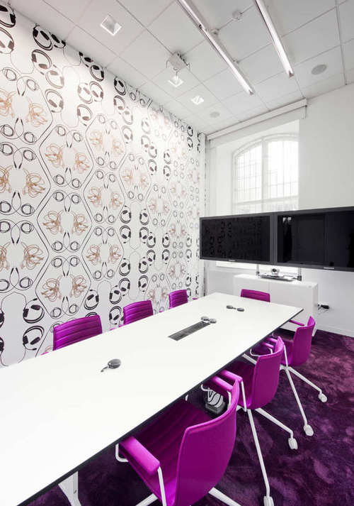
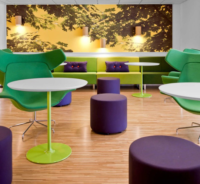
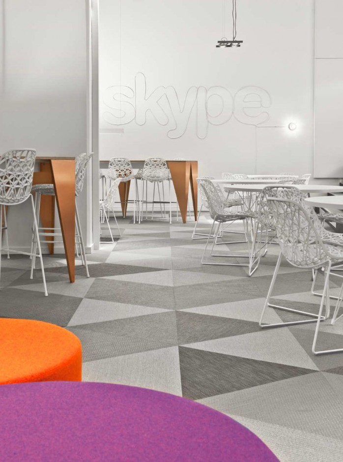
The Stockholm-based architectural firm PS Arkitektur designed the new Swedish office for Skype. The project consists of audio and video studios, offices, and social areas for 100 employees.The idea of the bubbly motif has evolved from the Skype logo cloud and can be found on everything in the office, from furnishings to decorations. Unlike other offices, at Skype, every space needs to have certain technical qualities since the majority of the work focuses on audio and video development. This focus is visible in the interior design as well. The use of unique wallpapers with prints of cables, earphones, and other devices nicely completes the bigger picture.
The design of the Skype office isn't only about visual appeal. Skype values a playful work environment in which employees are encouraged to think, play, and stay creative. The layout of the office optimizes the possibility of social meeting points as well as concentrated work. Instead of old-fashioned offices with cubicles, this office offers a mix of regular desks in open office spaces, hot desks, seating areas, meeting rooms, conversation booths, play areas, cafés, and silent areas.
Photo: Jason Strong
